.png)
This makes cooking feel like a chore rather than a fun activity. Digitizing the cooking space can add excitement and engagement to everyday meals. The current top rated apps on the market are shown below.
.png)
Bridging the Gap
Recipe apps miss key features like customization, note-taking, and community tools. I designed a platform with an AI assistant, social sharing, and nutritional insights to make cooking enjoyable and inclusive. The goal is to transform cooking into a community-driven experience.
I also realized that an active community with interactive elements and follower engagement can help attract users.

.png)
.png)
.png)
Guideline Principles
.png)
Beginning with the Research phase
I used the Design Thinking process, which was beneficial because it ensured the creation of user-centered and effective solutions by allowing continuous user involvement and iterations based on their feedback.
.png)
Competitor Analysis + Secondary Research
Initially, I planned to conduct primary research but struggled to find an audience that was enthusiastic or passionate enough to participate. As a result, I shifted to secondary research, exploring various online sources to analyze positive, neutral, and negative reviews.
These reviews included suggestions and complaints, helping me gain a deeper understanding of my audience. Below are some of the reviews that stood out to me and the insights I directly interpreted from them.
.png)
.png)

.png)
.png)
Affinity Mapping
Other insights, were further categorised into 4 groups.

With the help of the deliverables being categorised in the affinity map above, I came up with an extensive list of 12 insights listed below.
The research insights, color-coded based on the affinity map above, are listed below for clarity and better categorization. This approach highlights key themes and makes it easier to identify patterns across the data.
.png)
Personas
To really get a feel for the target users, I chose to create fictitious personas so that I can jump into the users' shoes and really understand their needs, wants, thoughts, and priorities.
I have differentiated the users based on their expertise in cooking to better understand the audience and cover a broad spectrum.

Based on the personas Mark (Beginner) and Priya (Professional Chef), I have created user journey maps to illustrate how each of them would experience a recipe platform and identify their pain points.


Along with Priya, Jane, and Mark, I decided to explore other plausible persona options from the perspective of their jobs. Based on five other occupations, I have documented a total of eight user stories below.
KitchenCraft caters to a diverse set of audience
.png)
Moving on to the Design phase
After collecting and organizing my research insights I moved onto designing these ideas and making my vision come to life.


After brainstorming with my mentor on how to incorporate all the features without overcomplicating the app, I designed six main pages. These were carefully planned after studying Zomato, an Indian multinational restaurant aggregator and food delivery platform, renowned for its convenient and user-friendly engagement.

Developed 20+ wireframes exploring various layouts, focusing on integrating social features seamlessly with recipe customization tools.
Low-Fi sketches & High-Fi sketches:

.png)
.png)
Green and Poppins. But why?
I chose the Poppins font for its approachable and community-focused feel. Its clean, rounded design conveys warmth and inclusivity, making it ideal for fostering engagement on a recipe app. The font’s versatility ensures readability across text sizes, enhancing the user experience.
Green was selected as the primary color for its vibrant, healthy appeal, symbolizing freshness and vitality. It adds energy and creativity to the interface, aligning perfectly with the app’s focus on food, wellness, and a lively cooking community.
.png)
Try out the prototype!
Usability testing- Revamping the solutions after user feedback
I conducted 24 interviews with a diverse group of users, including UX designers from leading companies, college friends, family members, and professionals from non-design fields.
.png)
.png)

.png)

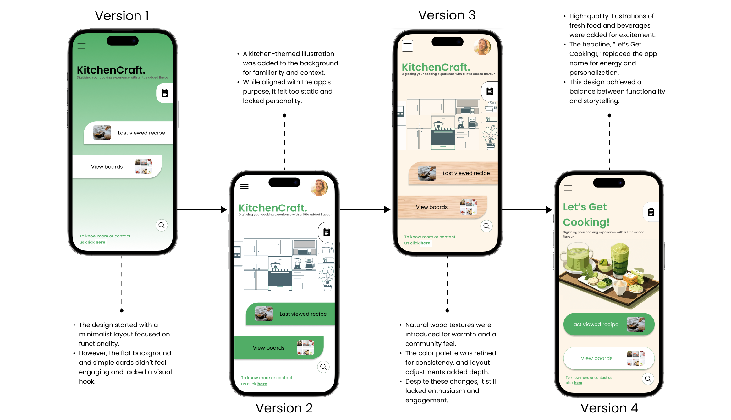
Main screen iterations

And it caters to cookbook lovers too! (Pun intended!)
.png)
Key takeaways

.png)