.png)
.png)
.png)
Context
.png)

It's an integral part of our payment system in India

.png)
So here's what I did
.png)
Quantifying user experience
.png)
Our research findings
.png)

Addressing the challenge: A walkthrough of our redesigned UPI experience
Here is a YouTube video of the entire walk-through of the re-designed app for our users and readers to better understand how the app works.
Try out the prototype!
Behind the solution: Our research process
.png)
We conducted a comprehensive analysis of the competitors in the market for our potential app redesign to gain valuable insights into the current state of the art, identifying key trends, features, and strategies that could inform and enhance the development of our own solution.

Our major insights from the competitor analysis
What we omitted (circled):
- Complex onboarding & persistent ads (FinArt) – We simplified the setup to enhance user experience by integrating it with an existing popular platform.
- Auto-disconnecting accounts & fixed login currency (Wallet) – Ensured stable UPI integration with flexible account settings.
- Manual data import & multiple accounts (Monefy) – Prioritized automated tracking over manual data entry.
What we included and paid extra attention to (underlined):
- Simplified, actionable spending insights (Spendee) – Avoided overwhelming users with excessive analytics.
- Focused on personal finance over dual accounts (Money Manager) – Tailored the design to individual UPI users rather than businesses.
UX research insights
.png)
Here is what some of our respondents had to say
.png)
.png)
Methodology
.png)
.png)
Brainstorming session with the team:

Since I was enhancing an existing platform (PhonePe), I skipped the wireframes and dove straight into crafting high-fidelity designs.
Version 1 was the first design iteration to the main PhonePe app and Version 2 (Final version) was the iteration after the usability studies.
Usability study insights (Conducted between the Version 1 and Version 2 prototype)
Usability studies were conducted through moderated sessions and a Google Form containing questions, the responses to which provided valuable insights and facilitated our thematic analysis.
.png)
Why do we conduct thematic analysis? How does it help?
.png)
Understanding why we conduct thematic analysis was a new learning that I found intriguing and something I would want to incorporate in my future projects too.

Thematic analysis shows that rewards motivate saving, UPI tools help control spending, and percentage-based graphs enhance clarity. Streamlined PIN entry improves usability, while minimalistic design and delay timers support the user experience.
However, navigation issues and limited impact of financial education pop-ups highlight the need to align features with real user needs.
.png)

We shared the video on Reddit, LinkedIn, and other platforms to gather insights for usability studies and refine our design. The video featured a complete prototype walkthrough. Users filled out a Google Form, and we conducted 20 in-depth, 30-minute moderated interviews for additional insights.
Final screens
These are the 5 main screens that were shown earlier. The existing PhonePe page, Version 1 and Version 2.
Version 1 was the first design iteration to the main PhonePe app and Version 2 (Final version) was the iteration after the usability studies.

The information icon, in Version 2, upon clicking shows the budget limitations for each of the categories.
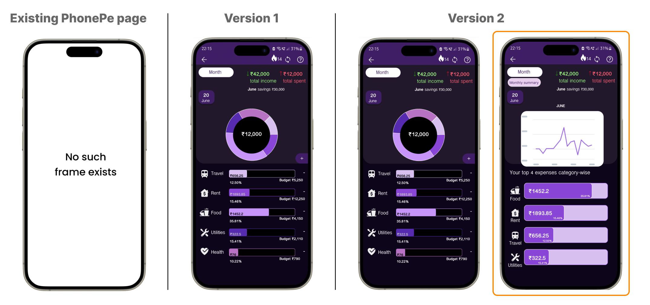
Version 2 also has a graph incorporated which shows spending patterns over a month or even a day.
An edit category button was included in Version 2 to change the payment category after the payment.

An extra miscellaneous expenditure category was created in Version 2 for any payments that don't fall into the major categories of that particular user.

Budget limitation pop-ups appear when the budget is exceeded. But for Version 2, I made it possible to opt out of the limit restrictions.
Other features that users liked in Version 1 without any modifications.

This frame displays the total amount in the bank account and the potential amount after the transaction that is about to be made.
.png)
This is a delay feature that let's users think twice about a payment. All such features can be opted out of based on user convenience.

The streak feature shows how many consecutive days the user has been spending under the budget limit.

As financial literacy is a major space we targeted. We made this page which is a fact that can help people while the screen is loading and if a user wants to read more then they can click on the information icon.
Our mixed-methods approach revealed that a majority of users report increased spending due to UPI’s intangible nature, while also expressing high satisfaction with its convenience. Our research offers actionable recommendations for UPI app developers and other stakeholders to enhance user engagement and support responsible financial management.
My Takeaways
.png)
Appendix
The Version 1 (V1) of the prototype can be found at this link.
The Version 2 (V2) of the prototype can be viewed at this link.
Our feedback form for the UX Research phase: https://forms.gle/jroDaAjdXLJ45hh47